Thierry Brunfaut, co-founder and creative director of Base Design, is coming to give a sold-out lecture at MAD about how he put his Brussels branding and graphic design studio on the world map. “You have to ensure that your mother also understands the message.”
Base Design: 5-Minute poster series
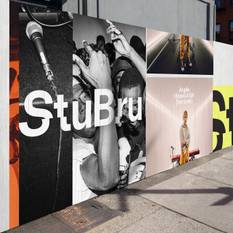
You may have noticed how the Flemish youth radio station Studio Brussel has been calling itself StuBru for some time now. And that the letters it uses for its communications on posters, websites, and social media have been crooked for more than a year. The expressionless red logo, which for a long time sought out the mainstream slightly too conspicuously, has definitively been consigned to the dustbin by Brunfaut and co. This is entirely aligned with the branding philosophy of Base Design to boil brands down to their essence and, if necessary, to reorient them to their target audiences. StuBru simply needed a slightly naughtier and more angular image than the boring oval previously suggested. The latter could have belonged to any hit radio station.
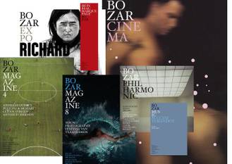
The rebranding that Base Design implemented at the radio station last year is a textbook example of the way in which it has been treating the house style of brands for just under a quarter of a century. The office has garnered exceptional praise in the non-profit and cultural sectors. Locally, they launched “identity creating” campaigns for Bozar (yes, they invented that name too), and De Munt/La Monnaie. Internationally, the office has won awards for their branding of MoMA QNS. The little brother (annex warehouse) of the renowned Museum of Modern Art in New York received visitors during renovation works on the main building in Manhattan in 2002, and Base Design was called in to help guide the way.
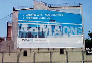
Base Design: MoMA QNS
The QNS capital letters were crucial to the campaign because they created a direct link in the minds of visitors with the abbreviations that airports also use. It was a way to cleverly indicate that the museum had moved and that visitors would have to travel to see the new exhibitions. Slogans like “MoMA moves forward” and “Manhattan » » Queens” pointed the way, while photos made the movement itself concrete. From left to right because Queens happens to lie east of Manhattan on the map. These are apparently simple specifics, but Base Design consistently emphasized them down to the smallest detail.
“We also cooperated with architect Michael Maltzan and his team seamlessly to integrate the identity and signage in the building,” Thierry Brunfaut has previously said about the campaign with which his office made its big break. “We spent two months designing a system of pictograms that were tailored to the visual language of the brand identity.” Such close cooperation is not surprising: Brunfaut is himself the son of two architects.
CHAMPIONS LEAGUE
Brunfaut founded Base Design in 1996 with befriended designers Juliette Cavenaile and Dimitri Jeurissen, former fellow students of graphic design at La Cambre – he never graduated, but he does teach there now. Almost twenty-five years later, he also continues to manage BaseBrussels and he sets the strategic course internationally. With offices in New York, Geneva, and Melbourne, the firm is firmly embedded globally. “Our branding for MoMA QNS put us on the map. As a small Belgian company, we had just opened our New York office, but it was thanks to that campaign that we were suddenly playing in the Champions League of design offices. That immediately opened doors for us in Belgium that had previously been closed.”
You have to ensure that your mother also understands the message
After the cultural sector, luxury brands like Chanel and Delvaux quickly also found their way to what had become the leading Belgian graphic design office for branding and identity. And in New York, big stars – from Isabella Rossellini to Christy Turlington and Kanye West – started frequenting the office for design tips about how they should market their books or albums.
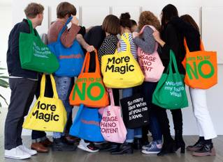
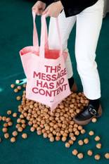
To reinforce his message, Brunfaut started writing short insights about design in 2012. He would give himself 300 seconds to invent each one. This so-called “5-Minute poster series”, printed in clear black and white letters, was not only featured on posters and tote bags, but it also conquered the internet. “Our most successful punchline so far has been 'So many likes when all you need is love',” Brunfaut says. “It had enormous appeal among young people. That is partly thanks to the slightly contrarian twist/undertone that makes the design office so trendy.”
Another popular one-liner – “Don't design for designers. Design for people” – is perhaps the best description of Brunfaut's company. “We keep emphasizing that. It might be fun to be thought cool in one's own little biotope, but that's not what it's ultimately about. You have to ensure that your mother also understands the message. So keep it simple. That is the key that I impart in my talks. And ensure that the way in which you communicate about brands is aligned with their audience. That is why we are so happy about our recent StuBru campaign.”
BRANDING IN 2020 WITH BASE DESIGN
19/2, 18.30 (sold out), MAD – Home of Creators
Base Design
Read more about: Expo , Base Design , Thierry Brunfaut , Bozar , MAD


Fijn dat je wil reageren. Wie reageert, gaat akkoord met onze huisregels. Hoe reageren via Disqus? Een woordje uitleg.